React dark mode switch with CSS and JavaScript.
After this reading on the dark side your app will be.

It sounds like repetitions on the header but no. Although this is a react tutorial, the core functionality won’t actually be react specific. This means you can use the logic on Angular, Vue.js and simple HTML/CSS/JS app.
Ideally you should follow up with react, but if you are smart enough you can code directly in your Angular or Vue.js app.
Code
The full code of this story is available on this git repository, you can pull it directly and continue as only important parts of the code will be explained.
Get Started
$ yarn create react-app dark-mode
// Add node-sass
$ cd dark-mode
Using sass is a personal choice you can go with CSS or SCSS as per your wish.
Add the following in your App.(jsx/tsx) and imports and import useEffect and useState from react.
const DarkSwitch: React.FC<unknown> = () => {
const [theme, setTheme] = useState(localStorage.getItem(“theme”));useEffect(() => {
  if (!theme) {
    const dark = window.matchMedia(“(prefers-color-scheme: dark)”).matches;
    if (dark) document.documentElement.classList.add(“dark”);
  } else if (theme === “dark”) {
    document.documentElement.classList.add(“dark”);
  }
});const toggleDark = () => {
  document.documentElement.classList.toggle(“dark”);
  const newTheme = theme === “dark” ? “light” : “dark”;
  localStorage.setItem(“theme”, newTheme);
  setTheme(newTheme);
};return (
  <label className=”dark-switch”>
  <input checked={theme === “dark”} type=”checkbox” onChange={toggleDark} />
  <span className=”slider”>🌞</span>
  </label>
  );
};
Use the DarkSwitch component in App() as follows
...
  Learn React
</a>
<DarkSwitch />
</header>
...
App.css
:root{
  --app-bg: #282c34;
  --txt-color: white
}:root.dark{
  --app-bg: #fff;
  --txt-color: black;
}.App {
  text-align: center;
}.App-logo {
  height: 40vmin;
  pointer-events: none;
}@media (prefers-reduced-motion: no-preference) {
  .App-logo {
    animation: App-logo-spin infinite 20s linear;
  }
}.App-header {
  background-color: var(--app-bg);
  min-height: 100vh;
  display: flex;
  flex-direction: column;
  align-items: center;
  justify-content: center;
  font-size: calc(10px + 2vmin);
  color: var(--txt-color);
}.App-link {
  color: #61dafb;
}@keyframes App-logo-spin {
  from {
    transform: rotate(0deg);
  }
  to {
    transform: rotate(360deg);
  }
}.dark-switch {
  position: relative;
  display: inline;
  width: 52px;
  height: 26px;
  margin: 15px;
}input {
  opacity: 0;
}.slider {
  position: absolute;
  cursor: pointer;
  top: 0;
  left: 0;
  right: 0;
  bottom: 0;
  border-radius: 34px;
  background-color: var(--txt-color);
  font-size: 17px;
  padding: 2px 3px;
  -webkit-transition: 0.4s;
  transition: 0.4s;
}
Normally every thing should be working and you should be able to change from light to dark.
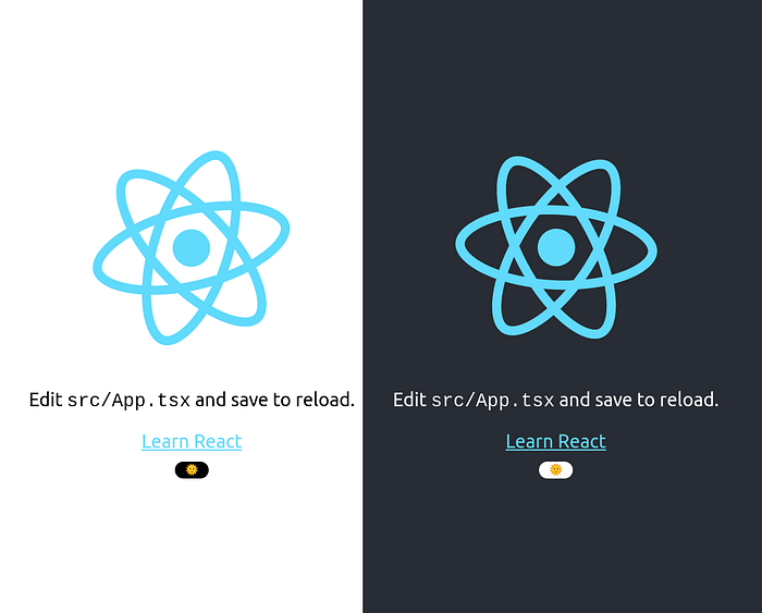
The dark theme is inside but what did we do?
Everything takes place in App.tsx and App.css. You can use the following instructions in any JS frontend web project no matter the framework, library or native javascript. The following explains the core of how to achieve theme switch.
1. In App.tsx
- Test if default browser theme is dark (returns a boolean)
window.matchMedia(“(prefers-color-scheme: dark)”).matches;- Toggle(Add or Remove) “dark” class name on root element(<html> )
document.documentElement.classList.toggle(“dark”)2. In App.css
- In App.scss
- Create CSS variables on root element selector and invert the colors when “dark” class name is present on it.
:root{
  --app-bg: #282c34;
  --txt-color: white
}:root.dark{
  --app-bg: #fff;
  --txt-color: black;
}
- Replace hard coded colors by “var(--variable)” every where in the CSS file like this.
.App-header {
  background-color: var(--app-bg);
  ...
  ...
  color: var(--txt-color);
}
All the other code in App.tsx is in majority platform specific. To be honest we could have limited this story to just this section but we had to prove that it works fine on react as the title says.
Conclusion
May be I missed something in my explanation that may have lost you; Kindly let me know in comments so that I can edit and make it more useful.
If you are using styled components you can still use this or you can use
May the force be with you.